BROWN
UNIVERSITY

BROWN
UNIVERSITY

BROWN
UNIVERSITY

BROWN
UNIVERSITY

Introduction
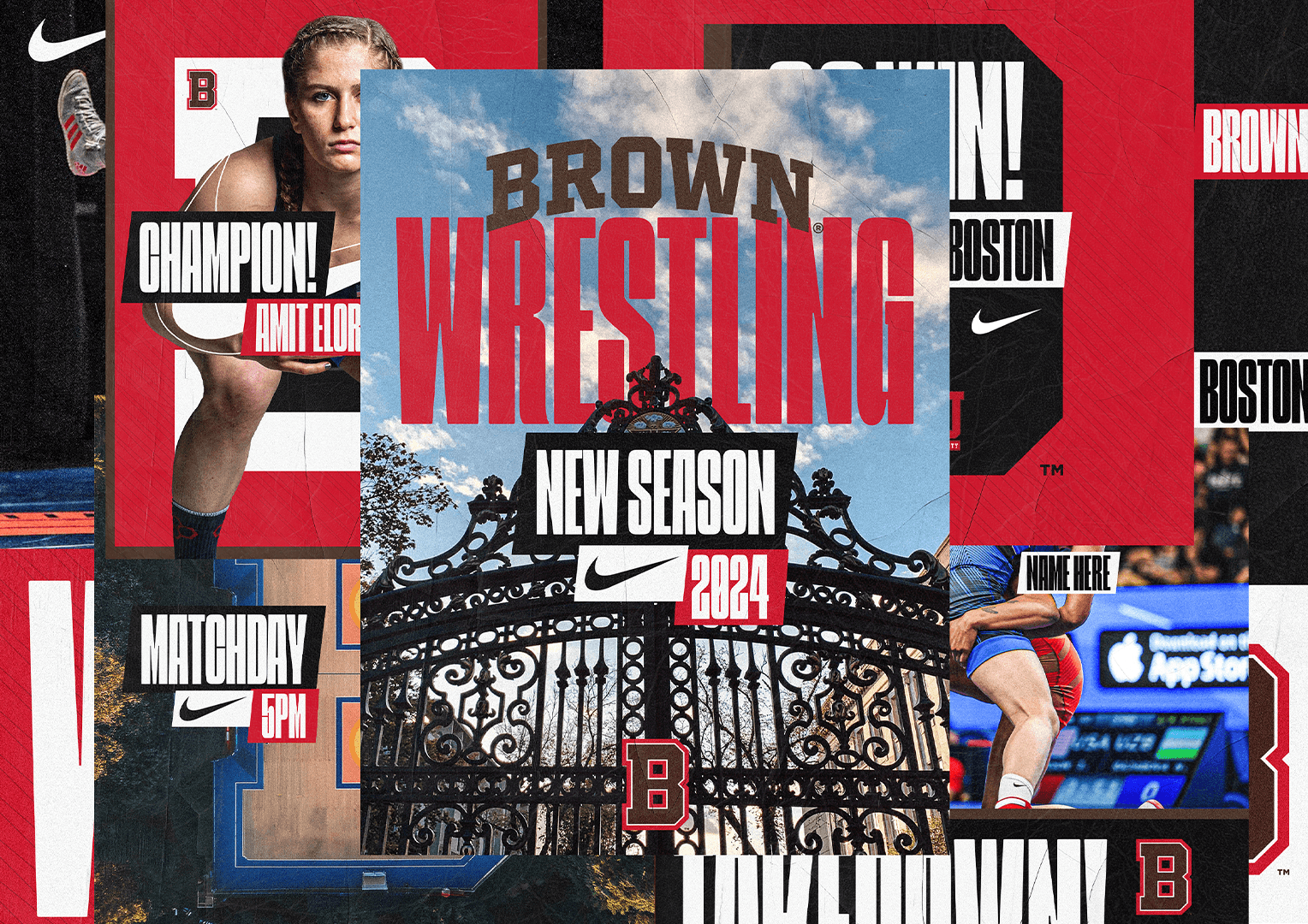
Brown University's Women's Wrestling team reached out to us to design a new graphic identity for their program. As a team that emphasizes both athleticism and empowerment, they needed a fresh, bold look that would resonate with their values.

Our task was to create a visual system that reflects their competitive spirit while showing a sense of unity and pride within the team and the wider university community.


Strategy

Strategy

Strategy

We decided to anchor the project around elements that represent the team's rich heritage and modern athletic prowess. We incorporated the iconic Van Wickle Gates of Brown University into the design.

These gates, a powerful symbol of tradition and passage, became a key element in the team's new graphic identity.

Process

Process

Process

We chose to use the university's primary colors and make them even more impactful. The typography is bold, adding a highly dynamic touch.

Result

Result

Result

Nicholas loved the final result . They felt that the graphic identity was unique and truly represented their program and values.

Copy Email!

Contact Us

+